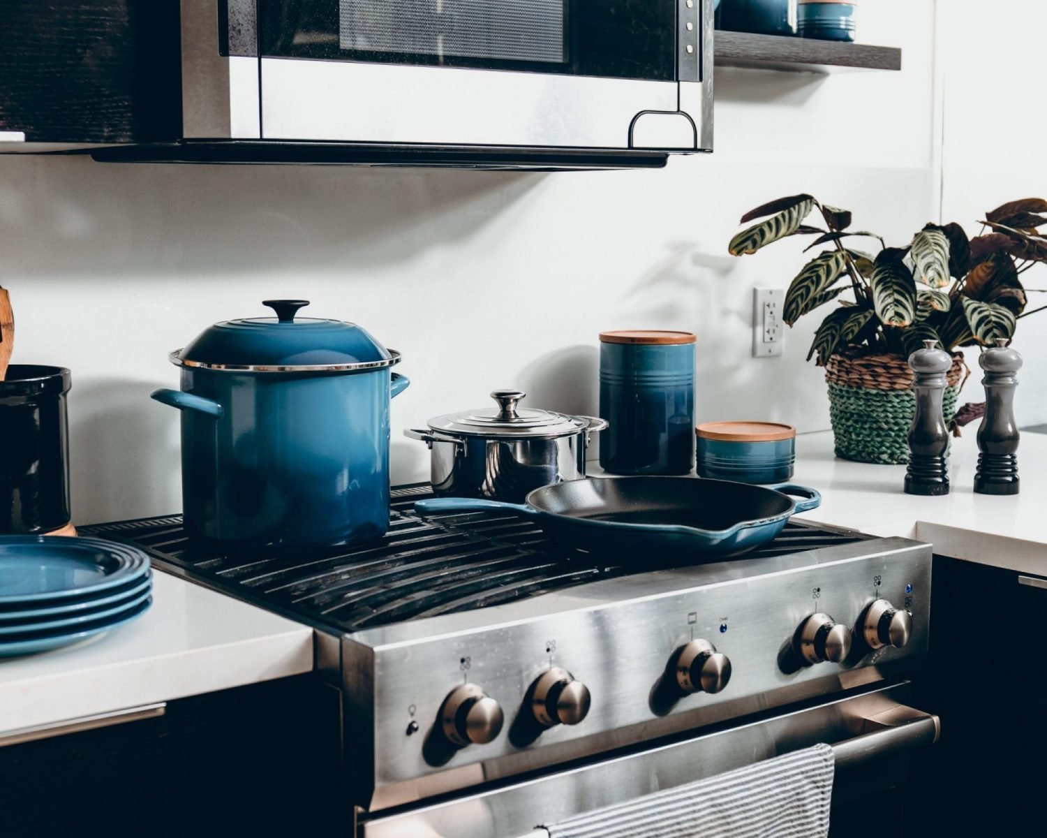
Since 2000, the Pantone Color Institute has announced the Pantone Color of the Year, which influences many industries including ones near and dear to us like home furnishings and ski fashion. Selecting a color requires analyzing trends in art, film, society, popular travel destinations, interior decoration and design, materials, textures, and so much more.
In December, the Pantone Color Institute declared “Classic Blue (19-4052)” for 2020; a shade about Pantone says, “a timeless and enduring blue hue, Classic Blue is elegant in its simplicity. Suggestive of the sky at dusk, the reassuring qualities of the thought-provoking Classic Blue highlight our desire for a dependable and stable foundation on which to build as we cross the threshold into a new era.”
We couldn’t applaud their decision more, especially since Classic Blue is a favorite of ours and is precisely the color of blue square trail signs at Sunday River. Here are a few ways to invite Classic Blue into your ski home this year and enhance its rustic-chic charm.
Accent walls are alive and well! They create contrast in an otherwise uniform room, and draw your eye in. Renter’s wallpaper can also be used if you’d like to try an accent wall out first (but we bet you’ll love it!).
Two words: Blue Cabinets. Classic Blue is on the darker side of the blue spectrum, yet is still neutral. When applied to cabinets, it makes a statement that is both bold AND subtle. Blue cabinets look great when paired with butcher block or white granite counter tops.
Start small! If you’re not ready to commit blue cabinets, try refreshing an old kitchen table: sand everything and leave the tabletop natural wood, then paint down from the aprons.
Splash some serenity in your bathroom by painting your vanity, or giving your claw-foot tub a Lapis Blue pick-me-up.
Personalize your nook by the fireplace with a Navy accent chair or cozy throw blanket.


